We were approached by Perfetti Van Melle to update the Airheads brand in an effort to change the perception that Airheads and Airheads Xtremes are just for kids. We worked closely with the client to evaluate and refresh the brands architecture, leading to the evolution of the brand’s character, tone and support messaging for use across campaign executions. Additionally, this evolution lead to a refresh of the entire catalogue of brand elements.

ILLUSTRATION
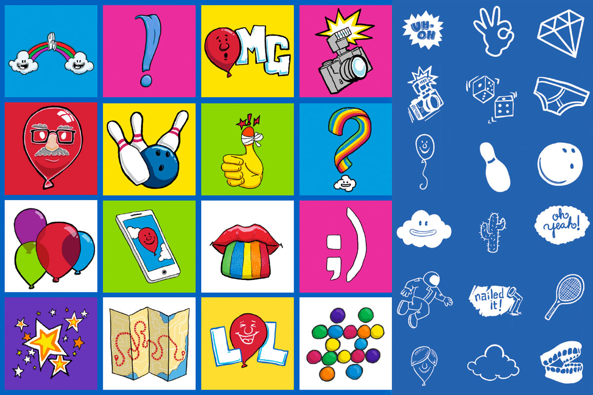
A series of simple illustrations and doodles were created for use as supporting graphic elements. Along with the principles we outlined in the brand guide, these graphics can serve as an example to other agencies in the creation of additional/custom illustrations.
TYPOGRAPHY
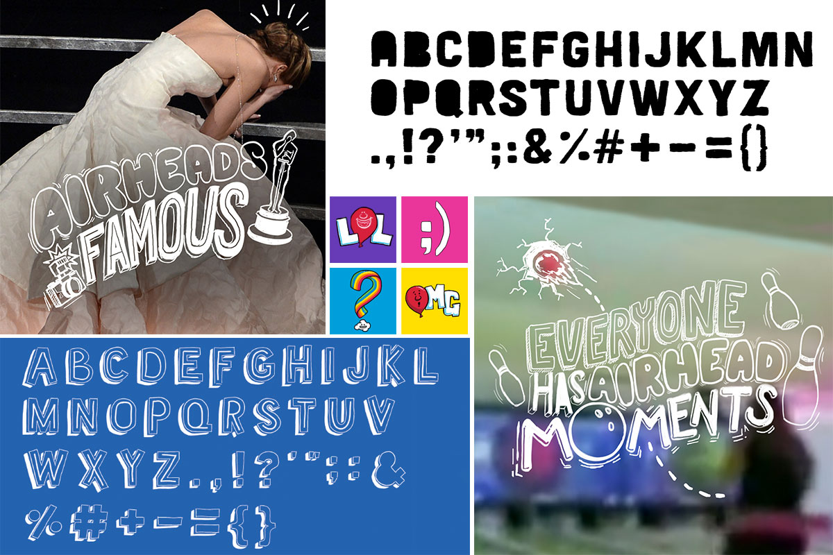
I created two typefaces as well as a guide for the creation of custom hand-lettered type treatments to be combined with existing illustrative elements.
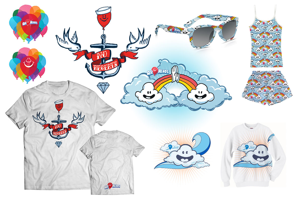
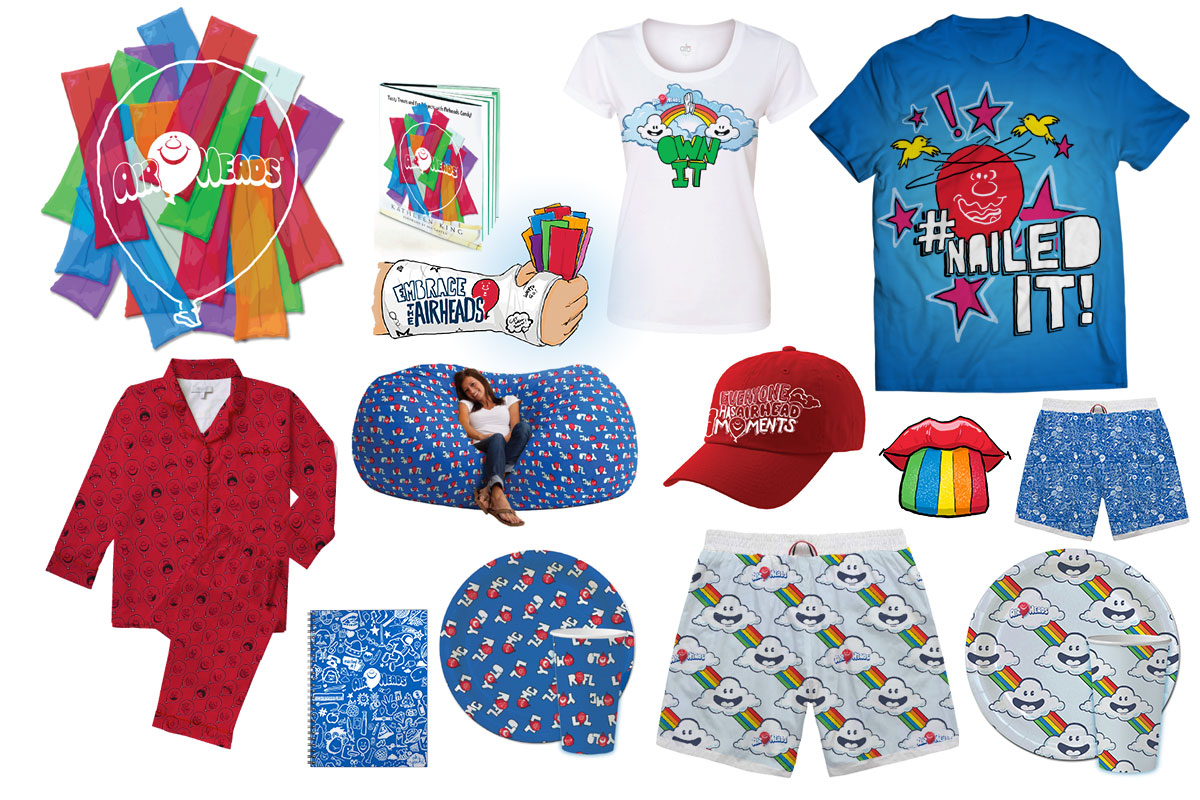
LICENSING
The illustrative and typographic principles were extended to the creation of graphics and patterns for use in product licensing.